I have a habit of wandering through link pages. One blog leads to another, and another, and I keep telling myself the next one will be even better. It is a pleasant way to waste time until something small starts to wear on you.
Many blogs now put an AI summary at the top of a post. In principle, that is fine. If the summary tells me what the piece is about, I can decide whether to read on. But some sites seem unable to stop summarizing. Click into an article and a dozen lines of summary appear before you have seen the first paragraph. At that point the summary is no longer helping; it is another thing to scroll past. The summary had summarized itself into a void.
That was annoying but survivable. The stranger part was the text. While I was reading, the letters started to twist and rearrange themselves. I thought my phone had picked up something nasty. Then, after ten-odd seconds, I realized it was a webfont loading. Where I live, in an urban village, the connection is painfully slow. When the font finally arrived, I could not remember the article’s point. I only knew that the font file was 7.89 MB and had taken 23 seconds to load.
I had just changed my own site’s font, so the experience made me want to write down the process in a way that is easy to follow. The font I am using now is Huawei’s HarmonyOS Sans, which can be found on Huawei’s official site. I usually prefer a rounded typeface; when the weight and size are right, it is much easier on the eyes.
My old method was simple: download the TTF, find a site that converts and compresses it into WOFF2, then reference that file from the blog. Sometimes the file still refused to get small enough. That is how you end up with the problem above: the font only finishes loading after you have already started reading, and the page shifts under you.
Here is a lighter approach. You need:
- A TTF font you like.
- Fontmin-v0.2.0-win64.
- A document containing 7,000 common Chinese characters.
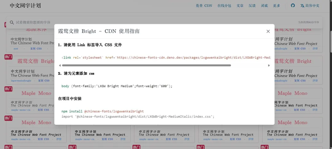
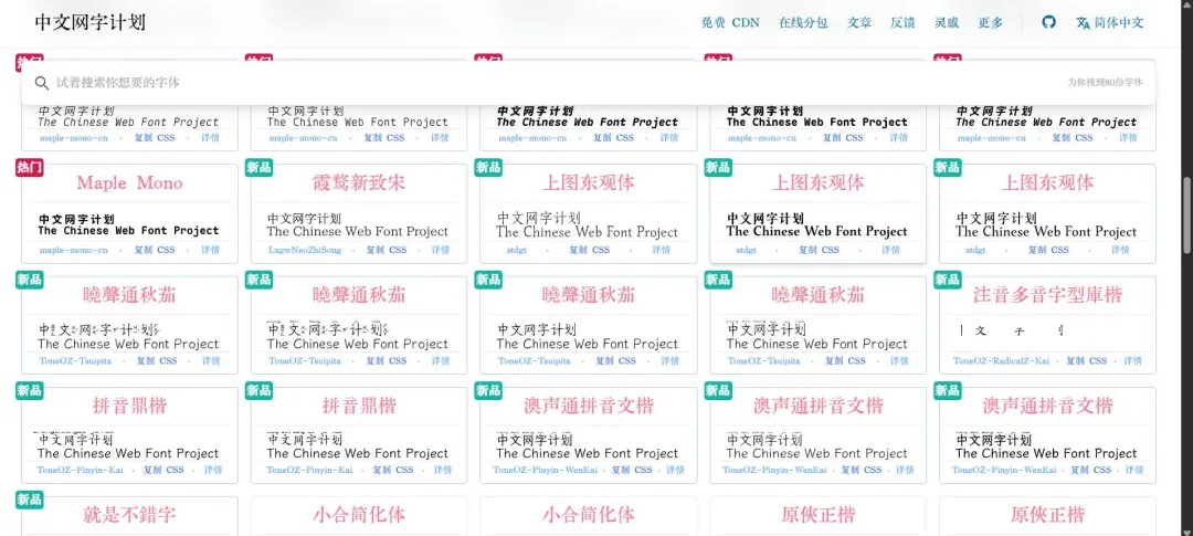
- 中文网字计划 (Chinese Web Font Project).
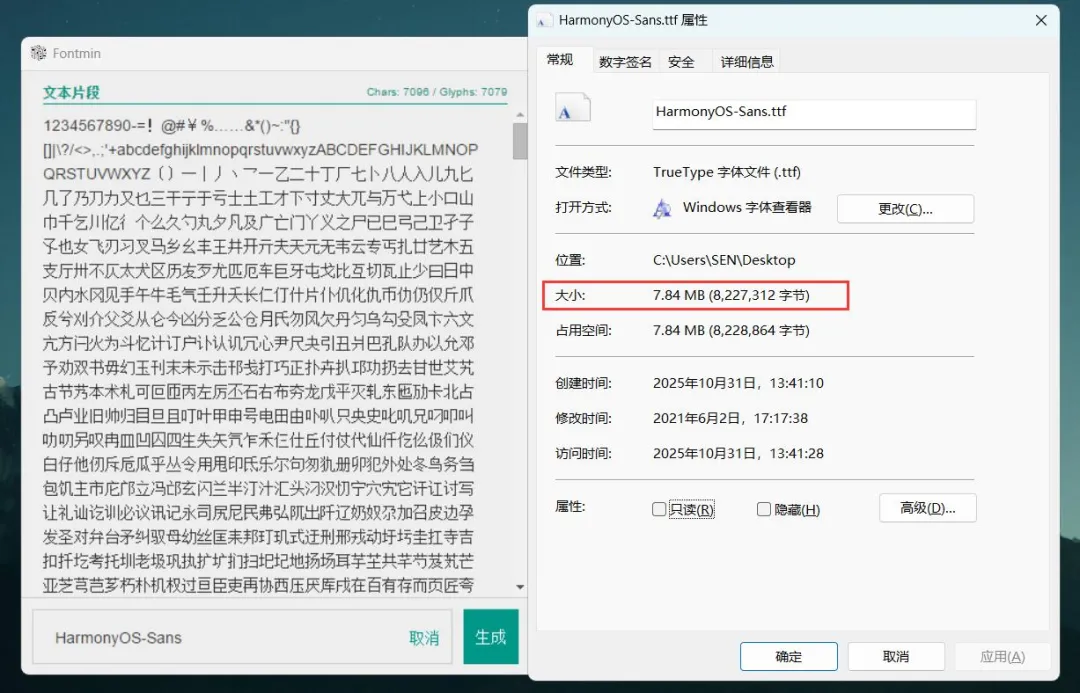
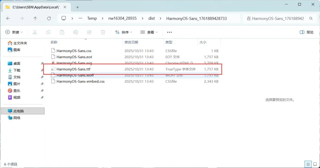
Open Fontmin and paste the 7,000 common characters into the input box. Drag your HarmonyOS TTF into the box below it, then click generate. After about ten seconds, it will produce an extracted folder containing the files you need. At this point HarmonyOS Sans should have gone from 7.84 MB to 1.75 MB. If that size is good enough, convert the TTF to WOFF2 and reference it in your CSS. If not, go one step further.
Next, open 中文网字计划 and click Online Subsetting (在线分包) in the top right. Drag the subset font file from Fontmin into the white area on the left. Click Start Font Subsetting (点击开始进行字体分包). When it finishes, click Compress and Download ZIP (压缩下载ZIP) in the bottom right corner.
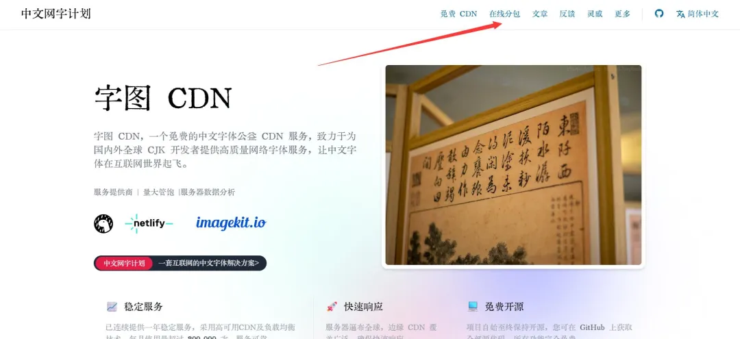
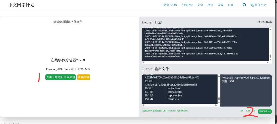
The last step is to put the whole folder from the ZIP on your CDN or server. Then reference result.css from the folder in your theme’s header.php, or wherever it fits best. For example:
<link rel="stylesheet" href="你的域名/result.css' ) ?>">
Open result.css and find the font-family name. In my case it is HarmonyOS Sans SC Medium. Then open your theme’s style.css, find body, and set the font-family:
body {
    ...
    font-family: 'HarmonyOS Sans SC Medium'
    ...
}
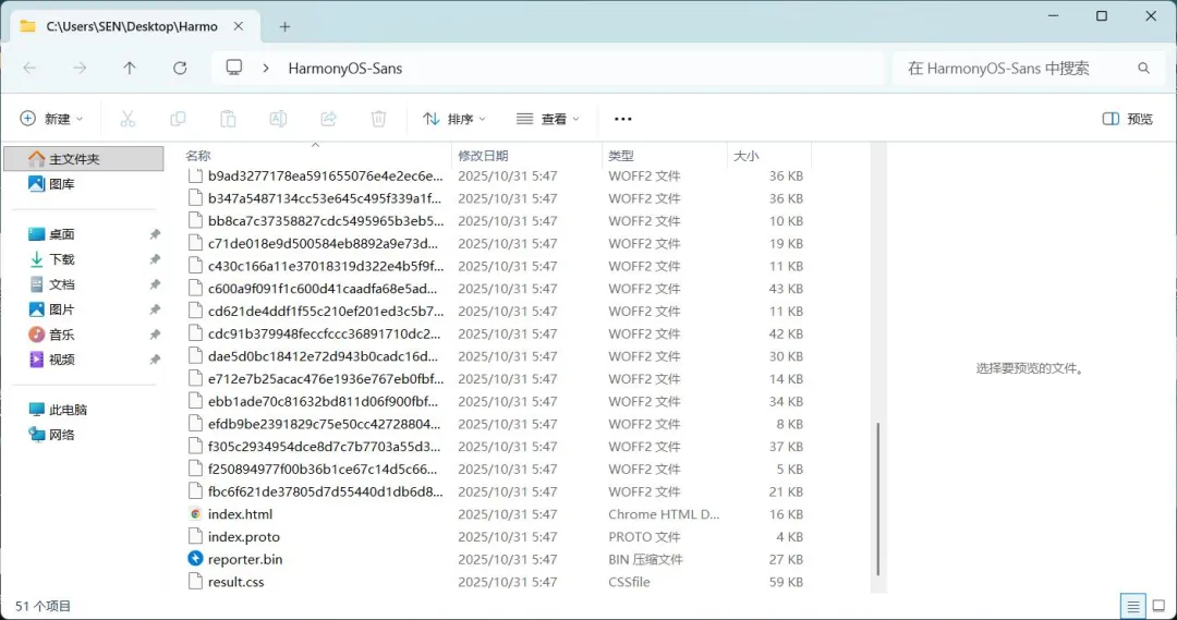
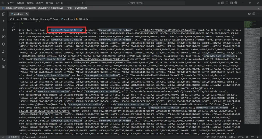
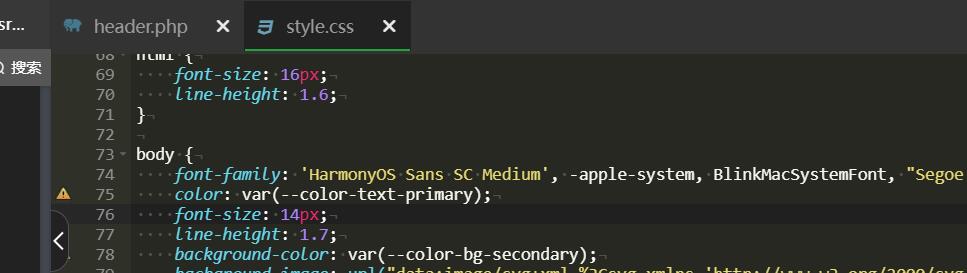
Refresh your cache and the font should show up. Loading will be much faster than before. Changing a font now and then can also give your eyes a break, but please do not put a flashy art font on a blog just because you can. A post should be comfortable to read, not a typography demo.
By the way, 中文网字计划 also provides CDN links and embedding instructions for many fonts.